科技
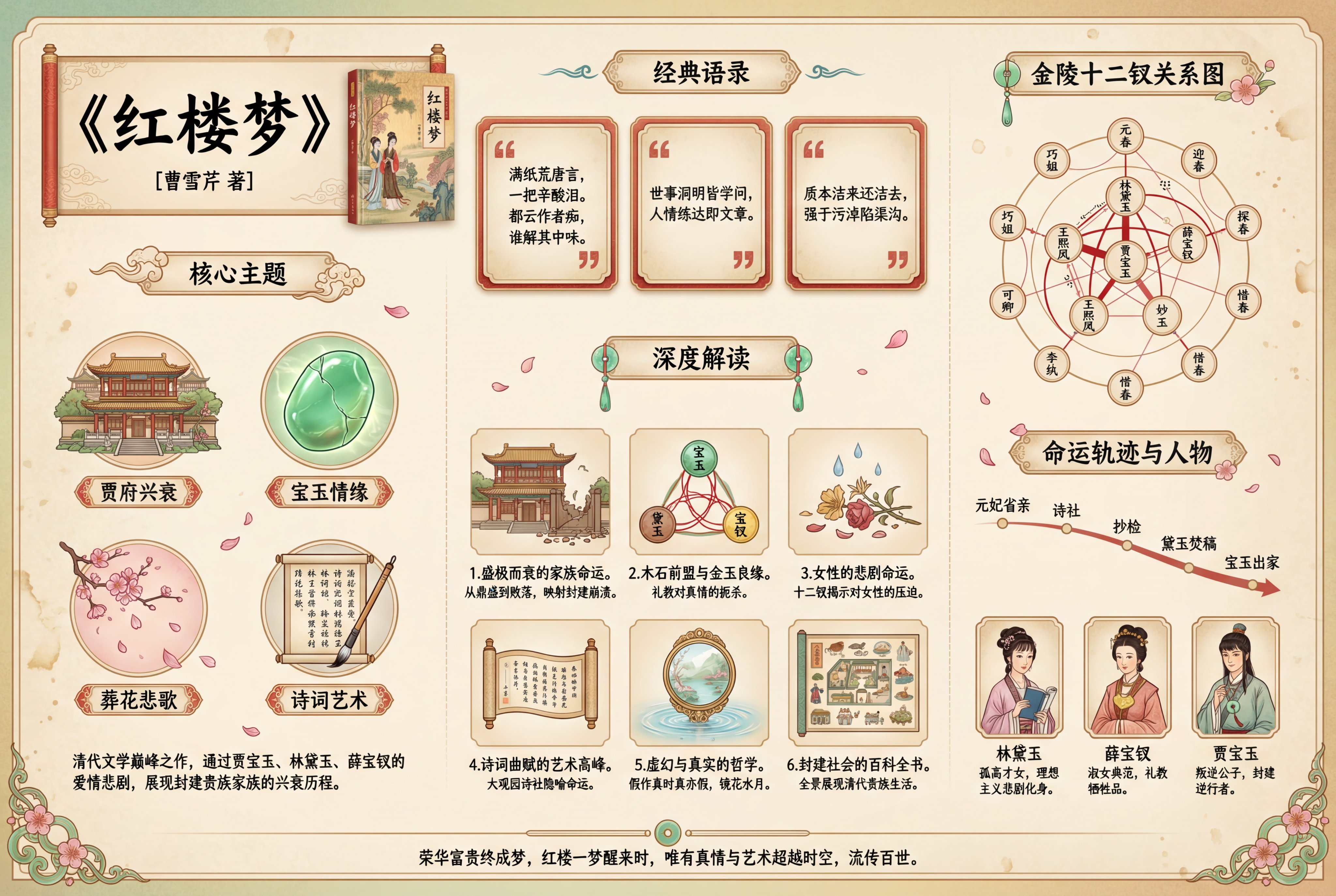
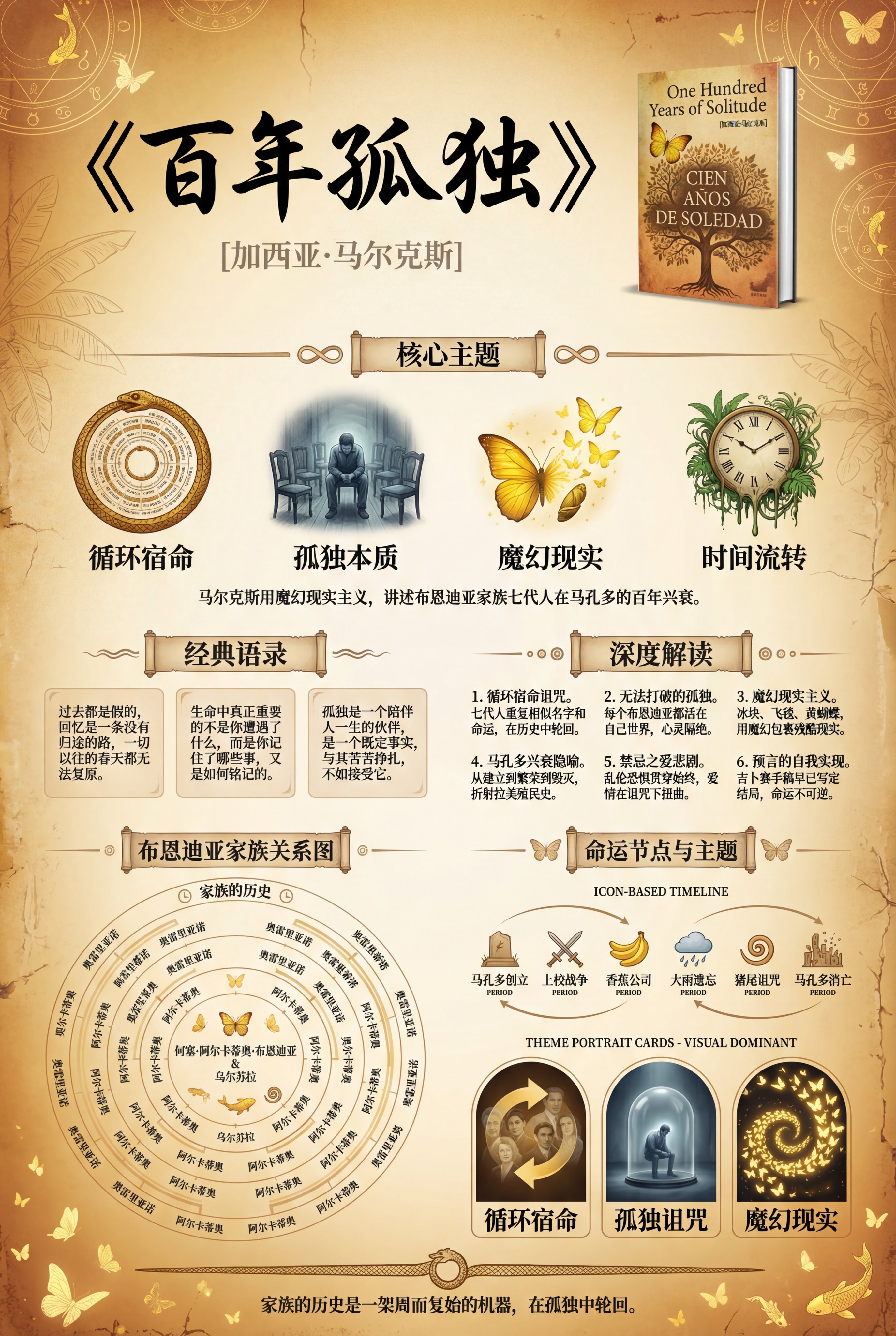
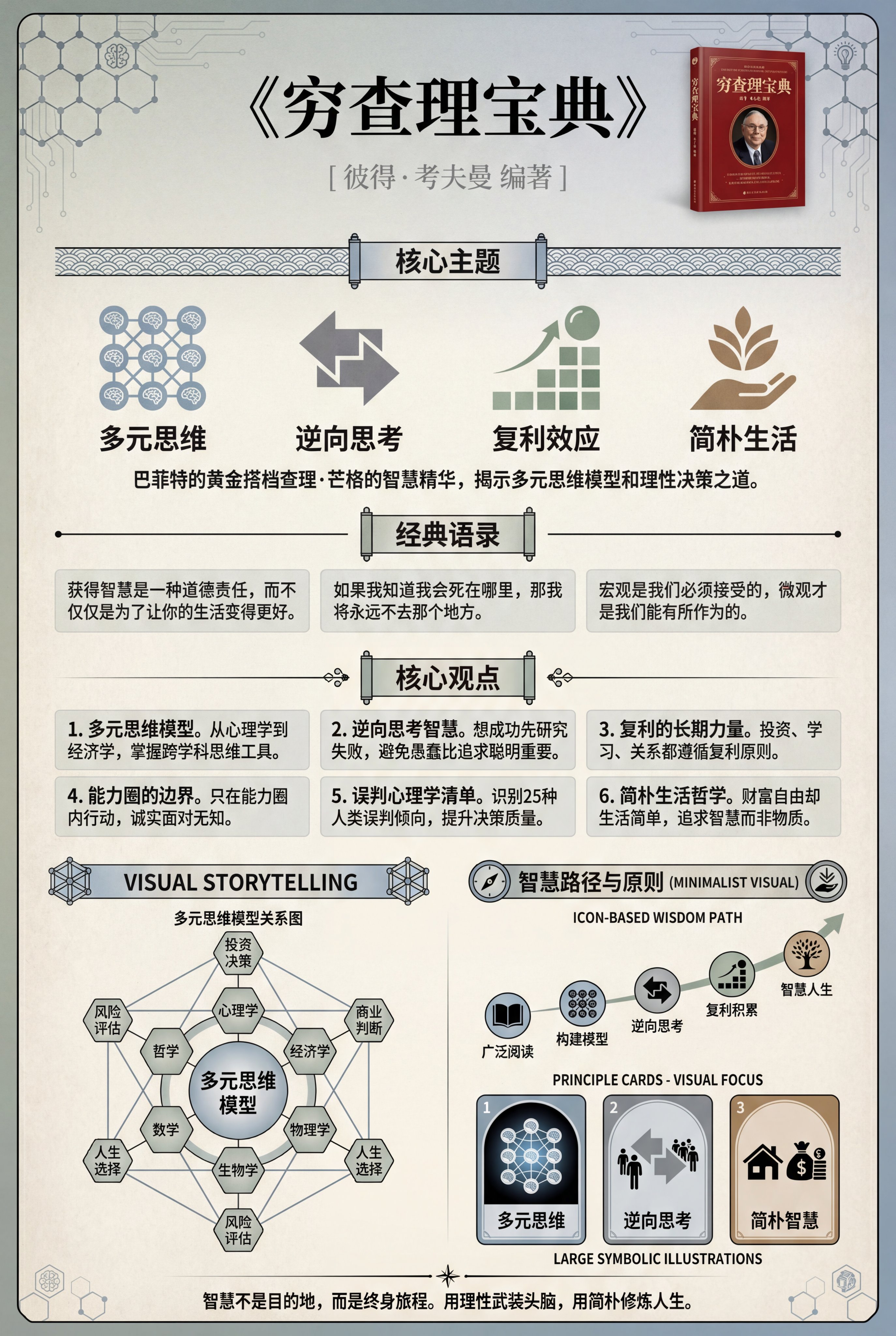
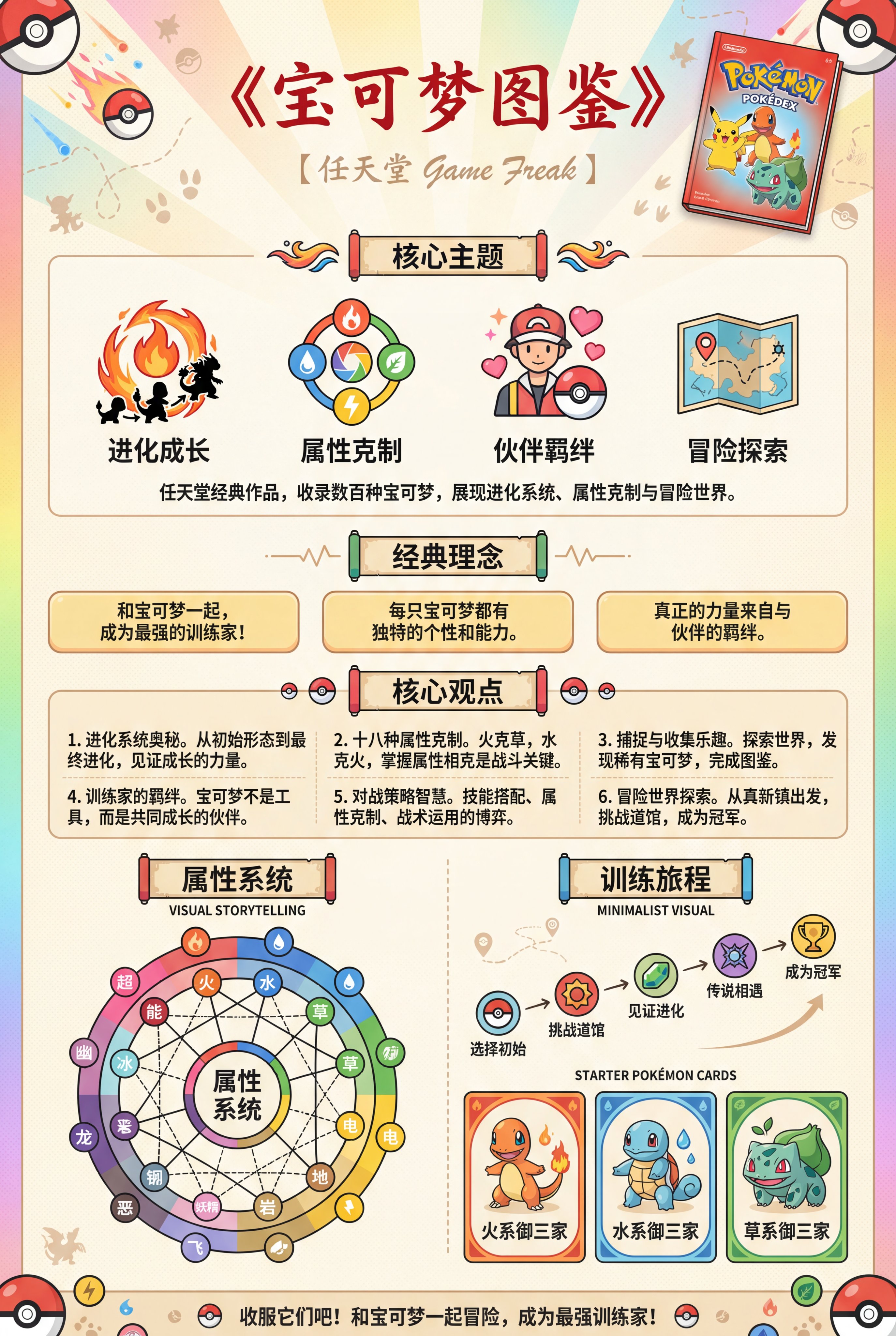
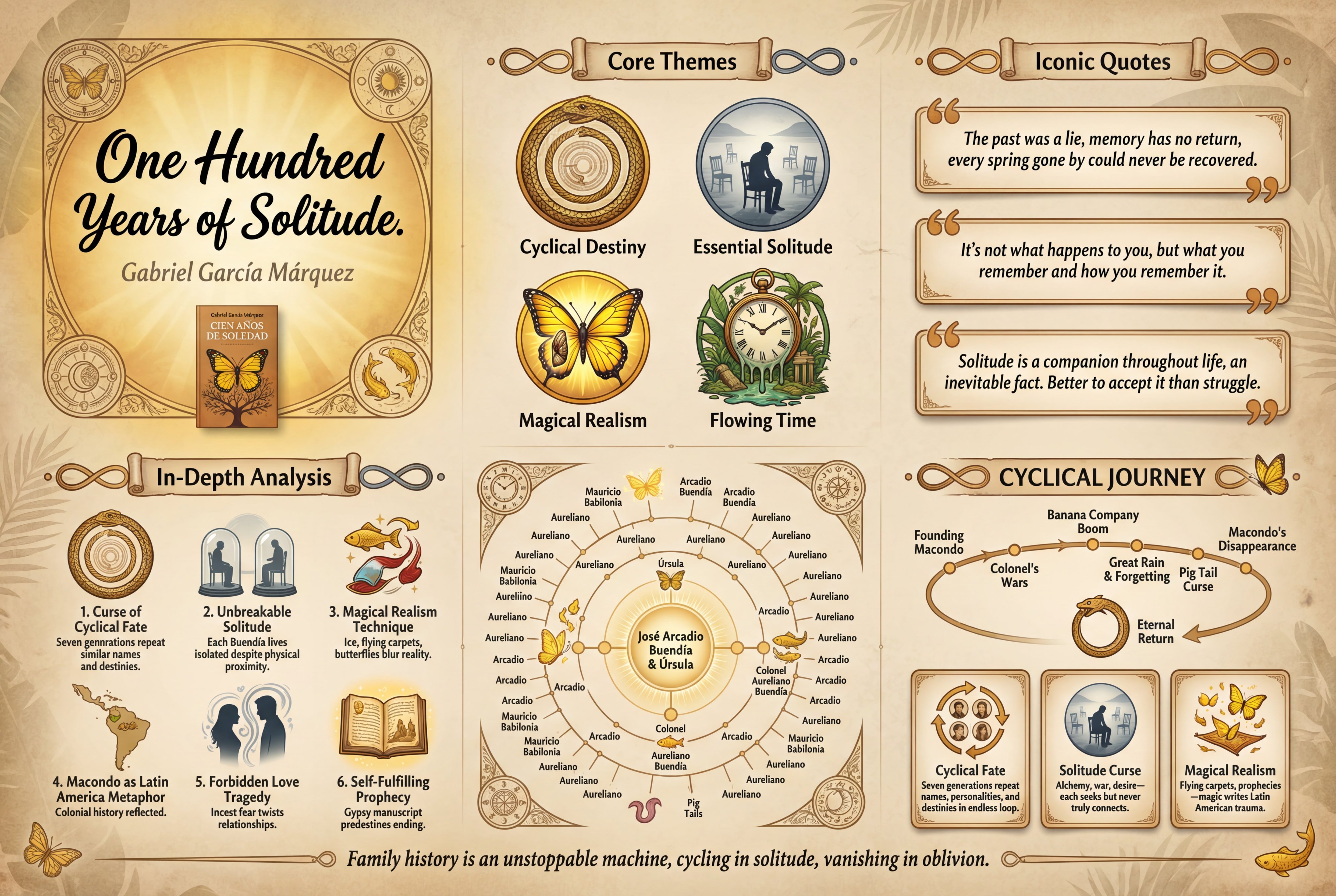
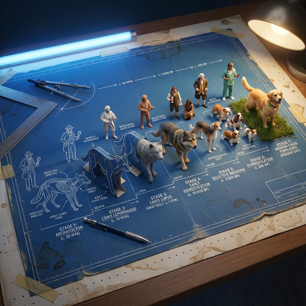
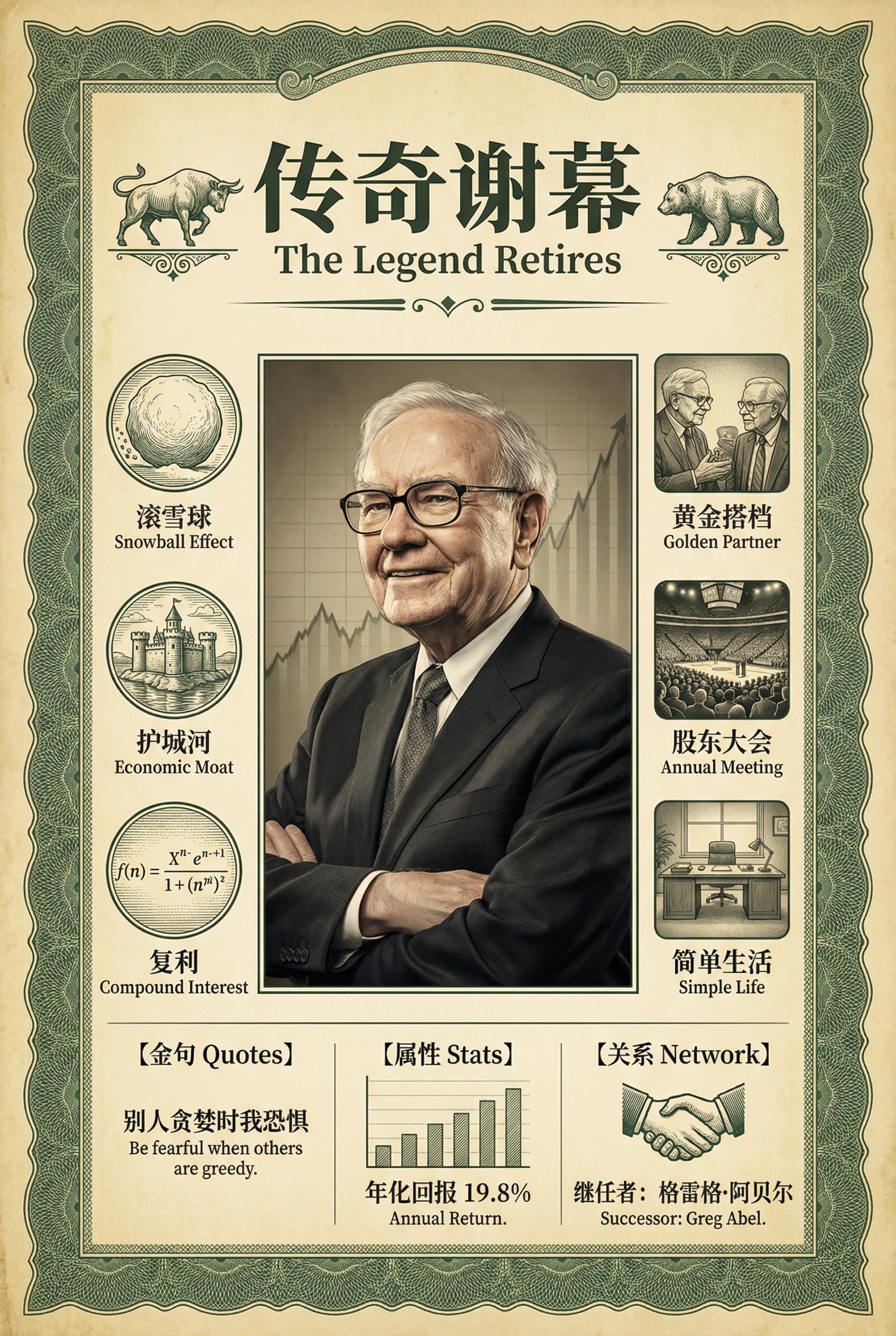
🔥兄弟们,这个真的趁早动手干啊!这套提示词做书籍、 书单、个性化小兴趣爱好的知识博主不能错过啊! 🧠灵感来源:早上看到群友分享了沐阳 @yyyole 分享一 个书籍推荐的海报,觉得设计不错,我在此基础上进行了 迭代二创。 这类图的核心本质和昨天的电影书籍海报都是同一类型的 属于结构化模块传递信息表达的一种方式。 迭代的内容主要是:更加的符合各个书籍的主题和对应的内 容配色以及细节的包括符号、人物元素等细节的提升。 ✍🏻包含多种多种组合风格:核心自适应维度(5大): 配色系统:5种预设方案+自定义 装饰纹样:12+主题适配纹样库 书法风格:4大流派+混合变体 受众年龄:4个年龄层级适配 内容类型:6大类型专属优化 组合在一起近乎5k多种组合,避免视觉疲劳。 迭代过程:遇到最开始文字过度,导致中文太多而崩掉的问 题,所以包括字体和字数都进行了多轮的迭代到了目前的 V5.0版本可以实现稳定输出4K画质不稳定的状态。 记得交作业,留下你最喜欢的那本书!看看哪些书单出来 的最多,最值得阅读? Prompt见评论区,另有一键封装好的YOUMIND shortcuts 可以一键即可使用的版本! 一键封装的Shortcuts,开箱即用:https://t.co/lYO8AmXYD9 提示词Prompt: Prompt: A high-quality vertical educational infographic poster in a traditional Chinese retro style, designed for [TOPIC/BOOK TITLE] by [AUTHOR/CREATOR]. [VERSION 5.0 - FINAL STABLE EDITION WITH PROVEN CHINESE TEXT CLARITY] Background: - Radial gradient background creating subtle vignette effect, brighter at center, gently darkening toward edges - Textured paper surface with visible natural fiber patterns for authentic vintage feel - Delicate aging spots scattered subtly across the canvas - [Optional: SPECIFIC TEXTURE NOTE for theme] Header Section (top area): - Dominant bold calligraphy title at top center in [CALLIGRAPHY STYLE]: [MAIN TITLE IN CHINESE] Style: [Yan Zhenqing / Ouyang Xun / Xingshu] Color: Deep black for maximum contrast and clarity - [IF NEEDED] Subtitle in refined secondary script: [SUBTITLE] Noticeably smaller, medium grey - Author name in elegant small script: [AUTHOR/CREATOR NAME] Small and refined, warm grey - Small rectangular visual element in upper right corner: * Priority 1: Realistic published book cover with visible title and author * Priority 2: Stylized illustration of core theme * Priority 3: Symbolic imagery - Corner ornaments: [SPECIFIC PATTERN NAME] Subtle transparency, elegant traditional design Section 1 - 核心主题 (Core Themes, upper third area): - Ornate scroll-style section header with text "核心主题" - Decorative header ends: [SPECIFIC STYLE] - Four large prominent icons arranged horizontally with generous spacing: * Icon 1: [CONCISE VISUAL DESCRIPTION] with label [KEYWORD 1] - Accent color: [COLOR + MEANING] * Icon 2: [CONCISE VISUAL DESCRIPTION] with label [KEYWORD 2] - Accent color: [COLOR + MEANING] * Icon 3: [CONCISE VISUAL DESCRIPTION] with label [KEYWORD 3] - Accent color: [COLOR + MEANING] * Icon 4: [CONCISE VISUAL DESCRIPTION] with label [KEYWORD 4] - Accent color: [COLOR + MEANING] - Icons evenly spaced with comfortable breathing room - Introductory text paragraph (ONE CLEAR SENTENCE with moderate length): "[ESSENCE OVERVIEW - approximately 30-50 characters providing context]" Section 2 - 经典语录 (Quotes Section, central emphasis area): - Ornate scroll-style section header - Three rectangular quote boxes arranged vertically with comfortable spacing: * Each box: Soft contrasting background, refined border, gentle shadow * Generous internal padding * Large decorative quote marks * COMPLETE QUOTES (preserving literary value): - Quote 1: "[FULL QUOTE - 16-25 characters, complete meaningful sentence]" - Quote 2: "[FULL QUOTE - 16-25 characters]" - Quote 3: "[FULL QUOTE - 16-25 characters]" - Comfortable vertical spacing between boxes Section 3 - 核心观点 (Key Points Analysis, main content area - FULL DEPTH): - Ornate scroll-style section header with text "核心观点" - Six-item grid in 2 columns x 3 rows - ASYMMETRIC LAYOUT for visual rhythm: * Items 1, 3, 5: Icon LEFT, text RIGHT * Items 2, 4, 6: Text LEFT, icon RIGHT - Each item: Medium icon + numbered point with moderate depth - BALANCED TEXT (sufficient depth without overcrowding): * Item 1: [ICON DESCRIPTION] + "1. [TITLE - 4-8 characters]. [CORE INSIGHT - 28-35 characters]" * Item 2: [ICON DESCRIPTION] + "2. [TITLE]. [KEY EXPLANATION - 28-35 characters]" * Item 3: [ICON DESCRIPTION] + "3. [TITLE]. [ESSENTIAL POINT - 28-35 characters]" * Item 4: [ICON DESCRIPTION] + "4. [TITLE]. [BRIEF ANALYSIS - 28-35 characters]" * Item 5: [ICON DESCRIPTION] + "5. [TITLE]. [CONCISE SUMMARY - 28-35 characters]" * Item 6: [ICON DESCRIPTION] + "6. [TITLE]. [SHORT INSIGHT - 28-35 characters]" - Comfortable spacing between items allowing text breathing Bottom Section Split (MINIMALIST VISUAL STORYTELLING APPROACH): Bottom Left - 关系图谱 (Relationship Map): - Ornate scroll-style section header - [STRUCTURE TYPE: Hexagonal network / Circular rings / Tree diagram] - Central node(s): [PRIMARY ELEMENT(S)] - largest, most prominent - Connected satellite nodes: [SECONDARY ELEMENTS] - medium size - Outer ring nodes (if applicable): [TERTIARY ELEMENTS] - smaller - NAMES ONLY - NO descriptive text within diagram - Connection lines showing relationships, varying thickness indicating strength - Let the visual network structure tell the story Bottom Right - 时间线与人物 (Timeline & Characters - VISUAL FOCUS): - Ornate scroll-style section header Timeline Section (upper part of this area): - ICON-BASED TIMELINE with minimal text: * [4-5 KEY MILESTONES] connected by elegant arc or curve * Each milestone represented by DISTINCTIVE ILLUSTRATED ICON * Brief period labels ONLY (example: "元妃省亲" / "1950s" / "Chapter III") * NO lengthy descriptions, NO parenthetical explanations * Let icons visually narrate the journey * Arc or curve shape suggesting story progression Character/Theme Cards (lower part, VISUAL DOMINANT): - Three elegant cards with arch-shaped or refined frames - VISUAL FOCUS STRATEGY: * Primary element: LARGE CLEAR PORTRAIT or SYMBOLIC ILLUSTRATION * Secondary element: CHARACTER NAME or THEME TITLE ONLY * NO descriptive paragraphs - portraits tell the story - Card structure: * Card 1: [DETAILED PORTRAIT DESCRIPTION] + Large clear name/title: "[NAME/TITLE]" * Card 2: [DETAILED PORTRAIT DESCRIPTION] + Large clear name/title: "[NAME/TITLE]" * Card 3: [DETAILED PORTRAIT DESCRIPTION] + Large clear name/title: "[NAME/TITLE]" - Generous spacing between cards - Portraits occupy majority of card space, creating visual gallery effect Footer (minimal space): - Thin elegant horizontal divider with centered decorative motif - Inspirational closing statement (ONE SHORT SENTENCE): "[CLOSING MESSAGE]" - Scattered subtle decorative elements, very light opacity [Style & Aesthetics - Stability Optimized] Art Style Foundation: - Flat vector illustration with refined line art - Minimalist symbols with cultural depth - CONSISTENT CHINESE FONT: Noto Serif CJK SC (思源宋体) or Source Han Serif SC for ALL Chinese text throughout the entire poster - Elegant serif typography, bold calligraphy headers - Balanced generous negative space Color Palette: [SELECT ONE] *Classic Warm / Cool Scholarly / Elegant Ink / Nature Zen / Custom* Decorative Elements: [SPECIFY FOR THEME] - Frame: Double-line border, substantial margin - Corners: [SPECIFIC PATTERN NAME with description] - Section Dividers: [SPECIFIC STYLE] - Texture: Paper grain, vignette, [THEME-SPECIFIC TEXTURE] Typography - CJK CONSISTENCY CRITICAL: - All Chinese text uses same CJK-optimized font (Noto Serif CJK SC or Source Han Serif SC) ensuring consistent rendering quality - Title: Bold calligraphy in specified style (Yan Zhenqing / Ouyang Xun / Xingshu) - Section headers: Medium traditional font within scroll decorations - Body text: Clear comfortable size in CJK-optimized Songti - Captions: Small refined font for supporting info - Bottom section names: EXTRA LARGE and BOLD for maximum clarity Text Distribution Strategy: - Upper 70% of poster: Full informational depth * Core themes with context * Complete literary quotes * Comprehensive key points analysis - Lower 30% of poster: Minimal text, visual dominance * Relationship map: Names only * Timeline: Icons with brief labels * Character cards: Portraits + names only White Space Management: - Approximately thirty-eight to forty percent negative space - Extra generous margins in bottom section - Substantial spacing prioritizing absolute text clarity - Comfortable breathing room throughout Quality Standards: - High resolution suitable for large format printing (4K recommended for portrait) - Vertical portrait (2:3) or horizontal landscape (16:9) orientation - Crisp vector-quality lines with smooth curves - Zero text blur guarantee with minimalist bottom section approach - Museum exhibition standard presentation --ar [2:3 for portrait / 16:9 for landscape] --v 6.1 --q 2 --style raw --no blur, distortion, pixelation, visible measurements, technical annotations, duplicate timeline text, descriptive text in character cards, excessive text in bottom section, small illegible Chinese characters, cramped layout causing blur
书籍推荐海报
科技
nanoBanana-Pro
🔥兄弟们,这个真的趁早动手干啊!这套提示词做书籍、 书单、个性化小兴趣爱好的知识博主不能错过啊! 🧠灵感来源:早上看到群友分享了沐阳 @yyyole 分享一 个书籍推荐的海报,觉得设计不错,我在此基础上进行了 迭代二创。 这类图的核心...