Retro Mint Pop风格分析
标签
复制提示词
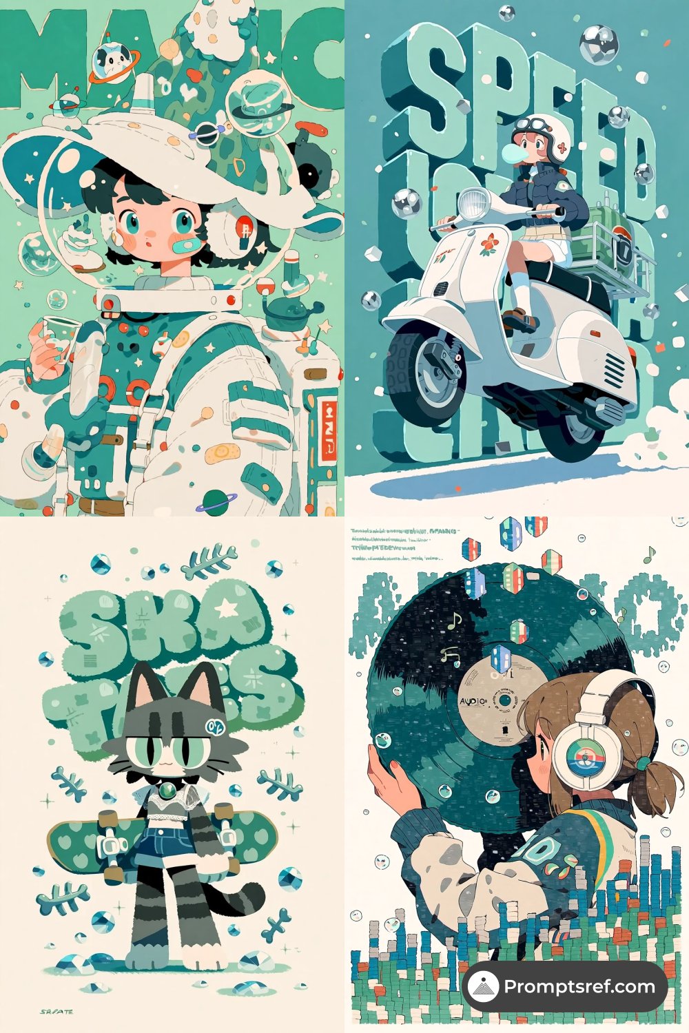
Jan 26, 2026 - Most popular sref on https://t.co/tOEsAuKP2K: 🏆 Top 1 Sref: --sref 1124116562 --niji 7 --sv6 ❤️ Likes number: 4 ✨ ## sref Style Characteristics Analysis This sref style presents an extremely distinct **Retro Mint Pop** aesthetic, cleverly blending the refreshing feel of **80s Japanese City Pop album covers**, the unique texture of **Risograph**, and the compositional logic of modern **flat vector illustrations**. Visually, this style brings to mind the summery color relationships found in the works of **Eizin Suzuki** or **Hiroshi Nagai**, but it handles them in a more cartoonish and flattened manner. It removes complex lighting gradients in favor of hard-edged color blocking. The most significant feature of this sref is its **unified high-brightness, low-saturation color palette**—dominated by mint green, ocean blue, and cream white—creating a crisp, retro-futuristic atmosphere. What makes this style memorable is how it breaks away from traditional illustration's pursuit of realism, turning visual elements into symbols and graphics. It excels at treating **Typography** as a graphic part of the background, making text blend into the scene like architecture or props, resulting in an image that looks both like an illustration and a highly polished graphic design poster. ## What is Retro Mint Pop Style? **Retro Mint Pop Style** is a visual style that combines the accessibility of Pop Art with the aesthetics of retro graphic design. Its core lies in "subtraction" and "color dominance." This style emphasizes clear outlines (or outlines-free color stacking), where characters and objects often have an independent, sticker-like quality. It deliberately mimics the slight misalignment of old-school printing and retro grain textures, yet the lines remain as clean as digital art. In this sref, color is not just filling; it is the protagonist that defines space and mood. This specific "mint filter" can instantly transform any subject (whether a sci-fi astronaut or a street skateboarder) into a relaxed, trendy, and decorative visual language. ## Retro Mint Pop Style Use Cases Due to its strong decorative nature and modern feel, **Retro Mint Pop Style** is highly suitable for the following creative scenarios: 1. **Trendy Apparel & Merchandise Design**: This style is perfect for printing on T-shirts, canvas bags, or making die-cut stickers because of its distinct color blocks, which are easy to print and have strong visual impact. 2. **Music Album Covers**: Especially for Lo-Fi Hip Hop, City Pop, or Indie Pop genres, this visual style perfectly conveys that lazy, retro auditory experience. 3. **Commercial Posters & Key Visuals**: Since this style naturally integrates typography elements, it is ideal for promotional posters for summer music festivals, art markets, or coffee shops. 4. **Zines & Independent Publications**: Its imitation of Risograph texture makes it very suitable for illustrations or covers of indie magazines. ## Retro Mint Pop Style Prompt Inspiration To generate works in this style, you can try the following prompt directions: * **Retro Tech**: A girl holding a giant game console, oversized buttons, mint green and cream white --ar 3:4 * **Summer Life**: A soda can splashing, bubbles floating, big text "SUMMER" in the background, flat vector art --ar 3:4 * **Street Trends**: A futuristic sneaker design, thick outlines, sticker art style, bold typography --ar 3:4 *Upgrade to become a website member to unlock all prompts on the site and gain more secrets for precise image control.* 🎨 Want to know how I use this sref? Check out the specific prompts on our website! 💎 website: https://t.co/L9d4VlZpm7 📩 Weekly newsletter: https://t.co/yMvTfSOITN 🔊 Join our Discord: https://t.co/Ov3gRP3AKN #midjourney #sref